This is a selection of completed projects from my graphic design traineeship. As you can see, there are multiple examples of projects from logo design to promotional work, all completed within a day or a week - either alone or as part of a collaborative.
As this traineeship was a few years ago now, some of the work may not look as refined as my other work, but I chose to publish them to not only show further examples of my work, but it also shows how much I have improved over the years.
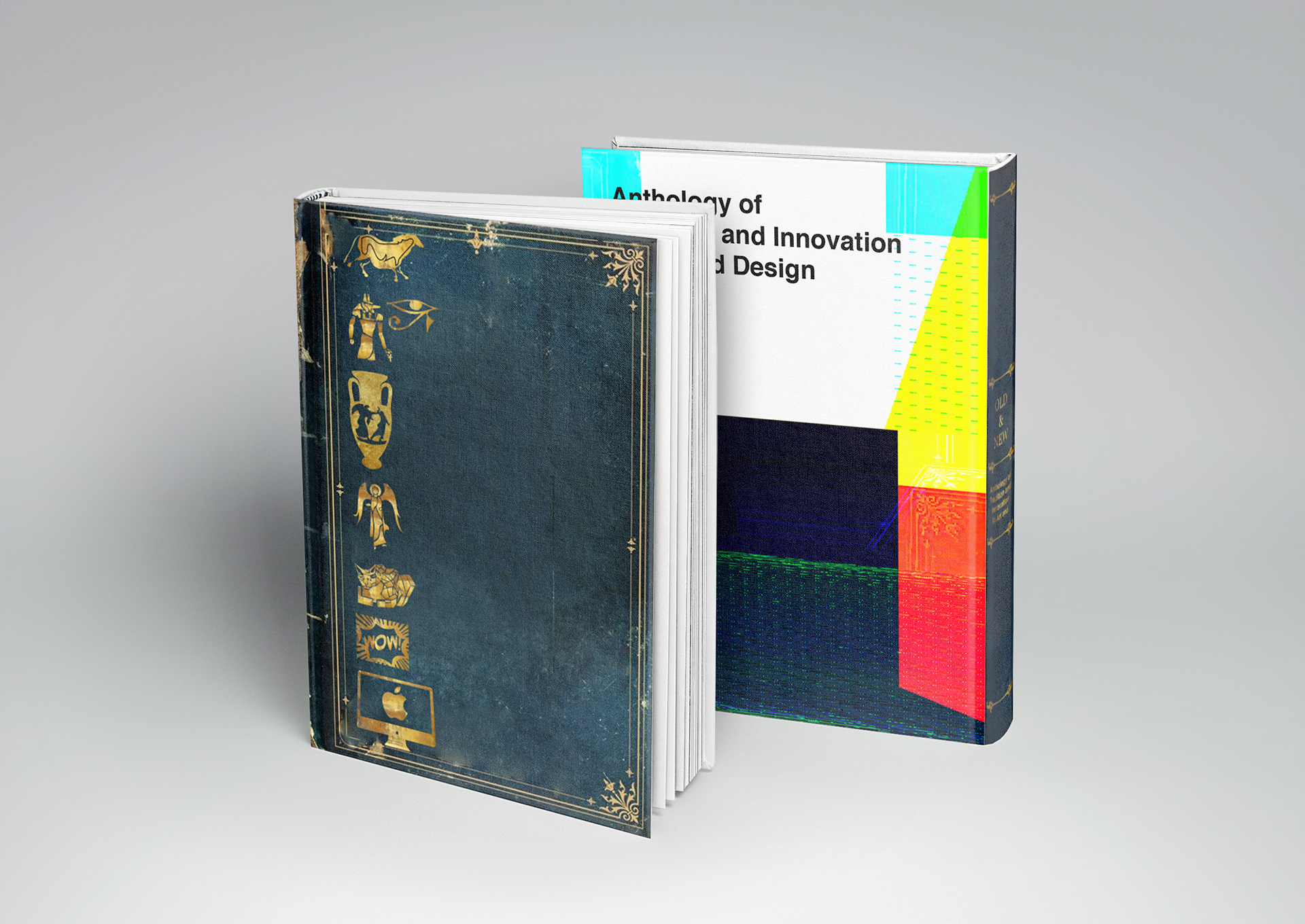
Above is a book cover design, for a book entitled "Anthology of Traditional and Innovation in Art and Design". The front cover features a gold timeline of art history - starting with cave painting and ending with digital art - on a old, worn book with a gold boarder often found on older books.
The back cover features a glitch art design, including the corner of the border on the front cover to bring the two separate styles together. The title also features on the back cover rather than the front, this is because there are already a lot of elements on the front, the title would make it look cluttered, whereas the back cover has more space and the San serif font fits nicely the the glitch effect, almost like an error message.
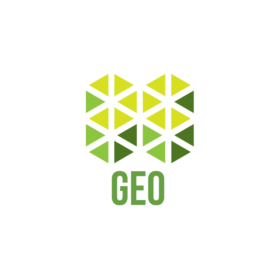
This is a brand logo created as part of a collaborative project. We were briefed to create our brand and create a logo to reflect it. We came up with the name "Geo" finding it worked in multiple ways, first being short for geometric - giving the idea that geometric shapes are often used in design, being clean, sharp and smart shaping, a perfect comparison for what a graphic design company should be.
Second, geography, as this was a traineeship we were all from different areas of the East Midlands so this seemed an appropriate way to bring us all together.
Finally, following on from geography, this also makes the name sound economical and environmentally friendly, a suitable selling point in this day and age when this is a must have for most people.
From this name and the reasons behind it, the logo design features triangles forming four cubes (as there were four in our collaborative) in four shades of green, reflecting the geometric idea of the name, the colour is instantly associated with the environment and the four shades represent the individuals behind the brand.
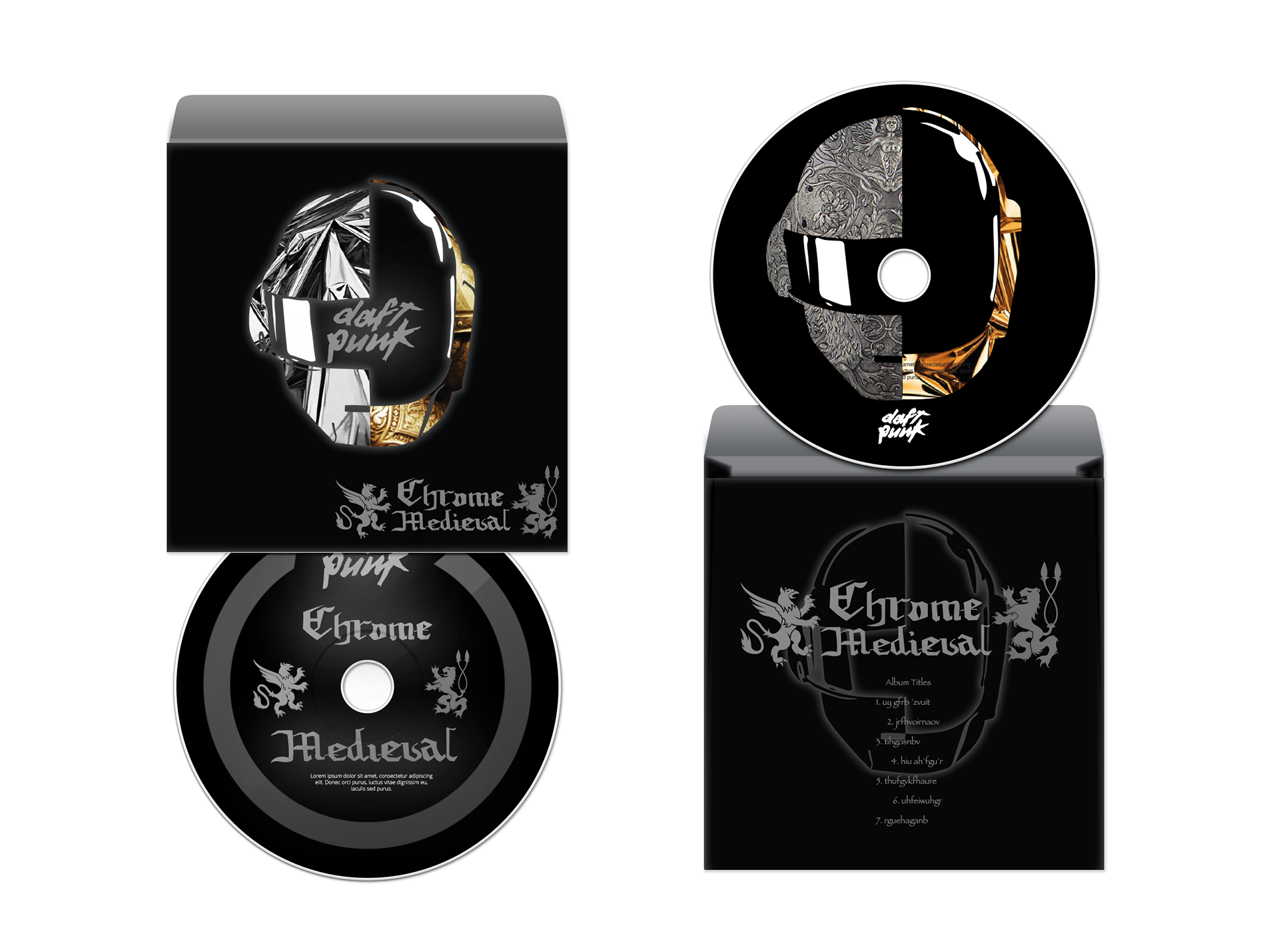
This project was to produce CD album artwork for "Daft Punk's Chrome Medieval". As you can see, I have chosen to interpret this literally, combining the trademark helmets of this artist with both chrome and medieval armour.
I designed the typography for the album title to reflect the medieval theme and used a predominantly black and grey colour scheme to really make the chrome stand out and eye catching, essential for album artwork as it needs to stand out on a shelf filled with other albums.
This particular project was really a pivotal one for myself, it became the reason I pursued illustration at university rather than graphic design due the the illustrative qualities I incorporated into this design.
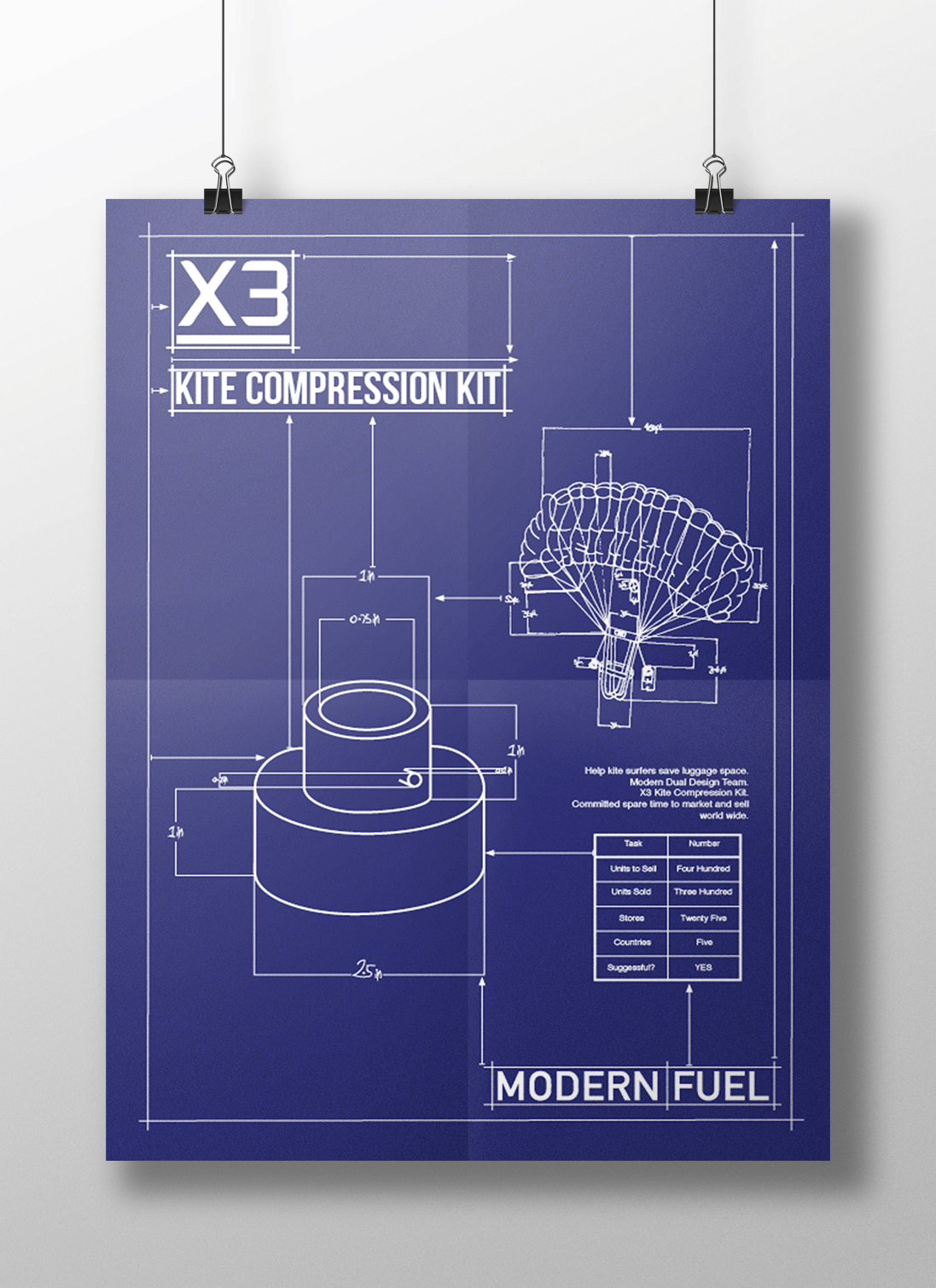
I was tasked with creating a promotional poster for a sporting company "Modern Fuel" and their new product, the X3. As this was a new product, their website talked about the multiple designs they had been through before they were happy with it, this gave me the idea for creating a blue print style poster to reflect their efforts to get this product to work correctly for their clients.
This white and blue combination would also be striking no matter the size of the poster, whether it was an A5 leaflet or blown up to a roadside billboard, these details will always stand out.
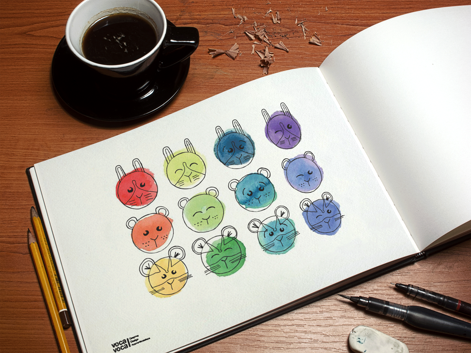
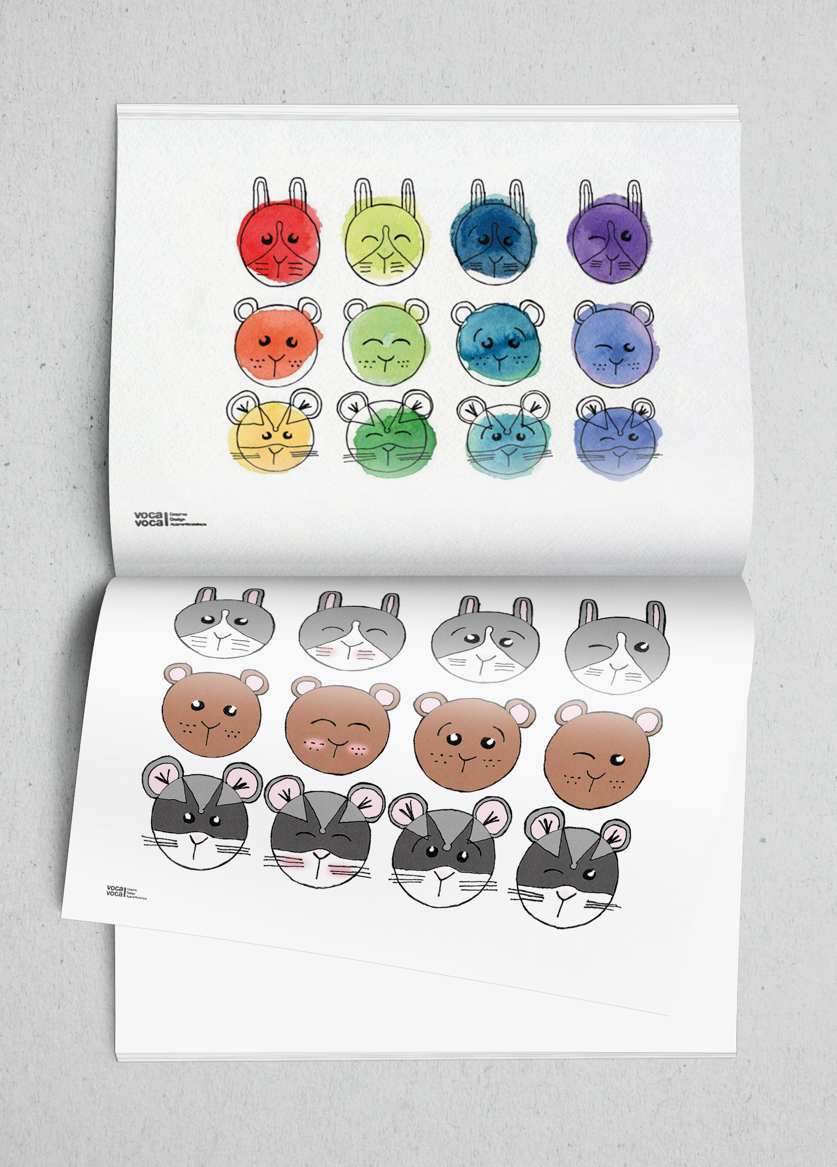
Above and below are a simple warm up task, draw something with the 12 circles in a minute. At this point, I had already begun researching illustration courses, so I decided to try a bit of character design.
I produced the 3 animal characters with 4 expression within the 60 seconds and later enhanced them by experimenting with different colour techniques, one more traditional with bold watercolour and the other a more digital block colour approach.
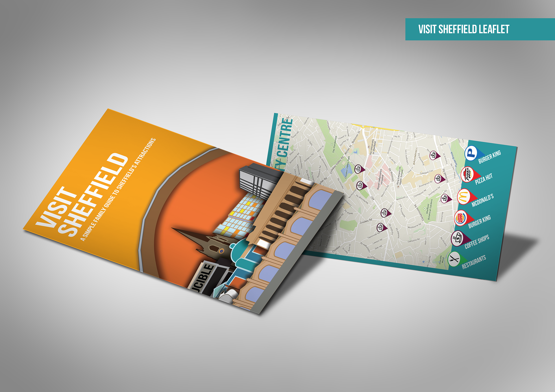
Above and below is the final collaborative project of the traineeship, create a tourist leaflet for Sheffield. We also had to create time sheets, quotations and invoices to prepare us if we chose to become self-employed.
We decided to aim our leaflet at young families, so provided 4 attractions, a selection of restaurants/cafés and hotels within walking distance form the cities train station that would be suitable. Our colour scheme is also bright and cheerful to appeal to children and makes the white text easier to read for families in a hurry. The illustrative design on the front of the leaflet feature some of the key landmarks found within Sheffield.